current-funnel-ux-review
outputs/agent-4-twofold-research/current-funnel-ux-review.md
Twofold Current Funnel — Expert UX Review
Executive Summary
Twofold Health's signup/onboarding funnel follows a conventional SaaS pattern: landing page → signup → 4-step onboarding wizard → NUX dialog → /new page. The landing page is professionally designed with strong trust signals (HIPAA badge, 4.8-star rating, real clinician testimonials) and clear value messaging. The hero immediately communicates the core benefit — auto-generated clinical notes — with transparent pricing ("Free for a week, then $19").
The onboarding wizard is lean (4 steps: welcome, name, specialty, note preferences) with smart personalization — specialty selection auto-configures note templates and note preferences default intelligently (psychotherapy → "the client", internal medicine → "the patient"). Feature flags (onboarding-note-customization-step, onboarding-specialty-improved) actively control variant delivery. The NUX dialog after onboarding presents three clear paths (record, demo, sample note) with progressive disclosure.
The critical weakness is the /new page activation bottleneck. After 7+ screens of setup, users land on a sparse page with a "Capture Conversation" button and little guidance. The mobile experience is particularly stark — 65% of mobile users never press the button. The page lacks confidence-building elements, clear next-step guidance, and emotional momentum from the onboarding. The gap between "you're all set!" and "figure out what to do" is where activation dies.
Overall Grade: B- — Strong landing page and onboarding personalization, but the value delivery is too late, the /new page lacks activation support, and mobile loses critical context. The biggest win would be moving first-value-experience earlier and adding guided activation on /new.
Flow Map
www.trytwofold.com                    app.trytwofold.com
┌──────────────────────┐              ┌──────────────────────┐
│ 1. Hero Section      │──CTA────────>│ 9. Signup Page       │
│ 2. Testimonials      │              │    (Google OAuth or   │
│ 3. Features          │              │     email/password)   │
│ 4. How It Works      │              └──────────┬───────────┘
│ 5. Value Prop CTA    │                         │
│ 6. Pricing           │                         ▼
│ 7. Security          │              ┌──────────────────────┐
│ 8. Footer            │              │ 11. Welcome Step     │ ← No data
└──────────────────────┘              │ 12. Name Step        │ ← First/Last
                                      │ 14. Specialty Step   │ ← Specialty + size
                                      │ 17. Note Preferences │ ← Patient/clinician naming
                                      └──────────┬───────────┘
                                                  │
                                                  ▼
                                      ┌──────────────────────┐
                                      │ 18. NUX Dialog       │
                                      │  • Record (recommended)│
                                      │  • Demo recording     │
                                      │  • View sample note   │
                                      │  • Skip               │
                                      └──────────┬───────────┘
                                                  │
                                                  ▼
                                      ┌──────────────────────┐
                                      │ 19. /new Page        │
                                      │  • Patient Name      │
                                      │  • Template selector │
                                      │  • Modality selector │
                                      │  • Capture Conversation│
                                      │  • (dropdown: Dictate,│
                                      │    Text, Upload)      │
                                      └──────────────────────┘

Total steps to first value: 8-9 (from signup CTA to app)
Estimated completion time: 3-5 minutes
Source Code Insights
Feature Flags Control the Flow
Two PostHog feature flags actively modify the onboarding experience:
onboarding-note-customization-step: When"test", adds a Note Preferences step (patient/clinician naming conventions). When off, shows a "You're all set!" completion step. Currently active in both desktop and mobile walkthroughs.onboarding-specialty-improved: When"test", adds subtitle "We use this to match your clinical language and note format" to specialty step and enables mobile-optimized search. Currently active.
Data Collection Strategy
- Name Step: First/last name via react-hook-form + zod. Pre-fills from Clerk auth or existing personal info. Tracks whether fields were manually edited.
- Specialty Step: Medical specialty (server-side list with search) + clinic size (4 options: solo, 2-9, 10-49, 50+). Selecting specialty auto-configures templates via
setEnabledCustomTemplatesByMedicalSpecialty. - Note Preferences (flag-gated): Patient referral (by name, "the client", "the patient", custom) and clinician referral (by name, custom). Smart defaults by specialty: mental health → "the client", others → "the patient".
State Management & Redirects
- Wizard step tracked via URL search param (
?step=1,2,3,4), enabling back/forward navigation. - Completion stored in
userSettings.didFinishOnboardingWizard(server) AND Zustand persisted store (client). - Redirect loop protection: max 3 redirects between
/onboardingand/newbefore Sentry alert.
NUX Dialog Behavior
- Appears after 2-second delay on
/newpage. - Won't show if group invitation dialog is active.
- Three options: Record (stays on page), Demo (→
/demo), Sample (→/notes/{sampleVisitId}). - Prefetches
/demoand sample note pages 500ms after dialog appears. - Skip tracks interaction type:
"skip_button"vs"outside_dialog"— both markdidFinishNuxDialog: truepermanently.
/new Page Implementation
- 4 capture modes persisted in localStorage: Capture Conversation, Dictate Session Summary, Text to Note, Upload Recording.
- Demo script card shown for users with
numberOfSuccessfulVisits === 0— links to/demo. - Patient context pane (desktop large only): 3 tabs (Assistant, Last Note Summary, Treatment Plan). Hidden when demo card showing.
- Mobile web: Separate component (
mobile-web/new-visit-mobile-web-component.tsx) with larger touch targets, simplified layout, bottom tab nav. - Minimum recording duration: 20 seconds (2s in dev). Shows "Recording too short" toast if violated.
- Permission handling: Detects Firefox → redirect. Denied mic → redirect. 5-second timeout for permission request.
PostHog Tracking Events
Every user interaction is captured: step views, field edits, button clicks (even disabled ones), NUX option selections, demo card clicks, capture type changes, permission states, recording duration violations.
Per-Step Analysis
Step 1: Landing Page — Hero Section (Desktop)
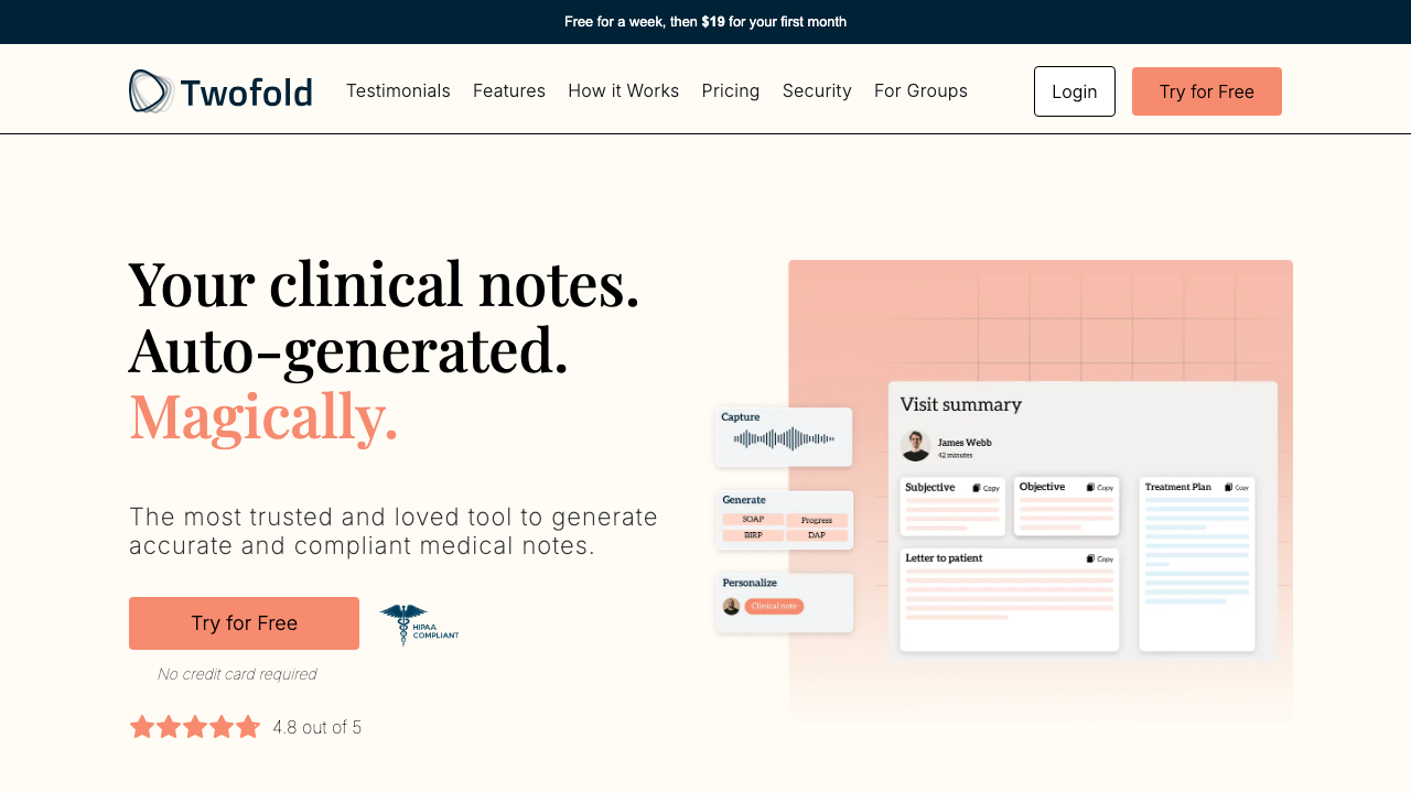
Grade: A-
| Dimension | Assessment | Grade |
|---|---|---|
| Visual Design | Clean split layout with warm peach tones. Product mockup on right shows actual app UI which builds credibility. Good whitespace. | A |
| Copy Effectiveness | "Your clinical notes. Auto-generated. Magically." — Clear, benefit-driven, memorable. "Magically" in coral adds playful contrast. Subhead reinforces trust. | A |
| Psychological Triggers | 4.8-star rating + HIPAA badge immediately address the two biggest objections (quality + security). "No credit card required" removes risk. | A |
| Interaction Design | Single CTA "Try for Free" is clear. Navigation bar well-organized with anchor links. | A- |
| Trust & Friction | HIPAA badge prominently placed. Star rating visible. "No credit card" reduces signup friction. Top bar shows "$19 first month" — transparent pricing. | A |
| Conversion Mechanics | CTA above fold with strong value prop. Only one action path — good. "Try for Free" is low-commitment language. | A |
| Technical UX | Page loads quickly. Responsive layout. Banner text is small on standard monitors. | B+ |
| Source Code Insights | CTA text is dynamically controlled via getCtaButtonText(Astro) — allows audience-specific variants. Multiple audience types supported (therapists, PTs, SLPs, etc.) with different testimonials. | A |
Top Recommendation: The hero product mockup is static — consider adding a subtle animation or interactive demo preview to increase engagement and show the product in action.
Step 1M: Landing Page — Hero Section (Mobile)
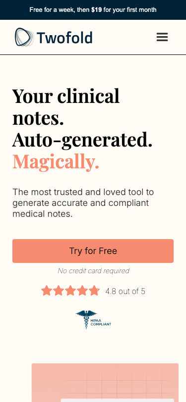
Grade: B+
| Dimension | Assessment | Grade |
|---|---|---|
| Visual Design | Clean single-column stack. Hero text is large and readable. Product mockup below fold. Good use of space. | B+ |
| Copy Effectiveness | Same strong copy as desktop. Full-width CTA is thumb-friendly. "No credit card required" visible. | A |
| Psychological Triggers | Star rating and HIPAA badge visible but below CTA — good sequencing. | B+ |
| Interaction Design | Hamburger menu hides navigation. Full-width CTA button is easy to tap. | B |
| Trust & Friction | HIPAA badge and star rating are below the fold but still visible in first scroll. | B |
| Conversion Mechanics | Full-width "Try for Free" CTA is prominently sized and well-placed. | A- |
| Technical UX | Responsive layout works well. Top promo banner is proportionally larger on mobile. | B+ |
| Source Code Insights | Same dynamic CTA text. Mobile uses different testimonial card widths (320px vs 458px desktop). | B+ |
Top Recommendation: Move HIPAA badge inline with or above the CTA to address security concerns before asking for action.
Step 2: Landing Page — Testimonials (Desktop)
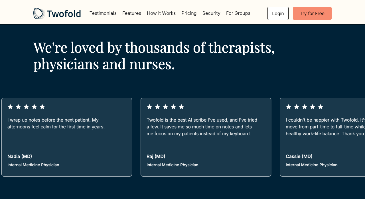
Grade: A-
| Dimension | Assessment | Grade |
|---|---|---|
| Visual Design | Dark navy background creates strong contrast with testimonial cards. Horizontal card carousel feels polished. | A |
| Copy Effectiveness | "We're loved by thousands of therapists, physicians and nurses" — strong social proof headline. Real names with credentials (MD). | A |
| Psychological Triggers | Social proof is the primary driver here. 5-star ratings on every card. MD credentials build authority. | A |
| Interaction Design | Horizontal scroll/carousel works but no visible scroll indicators on desktop. | B |
| Trust & Friction | Real clinician names and specialties build authenticity. Variety of specialties represented. | A |
| Conversion Mechanics | No CTA in this section — missed opportunity to capture momentum from positive testimonials. | B |
| Technical UX | Carousel animation is smooth. Cards are well-sized. | A- |
| Source Code Insights | 13 clinician testimonials for general audience, with specialty-specific sets (therapists: 9, PTs: 6, SLPs: 6, etc.). Infinite loop animation with triplication. | A |
Top Recommendation: Add a "Try for Free" CTA button after the testimonials section to capitalize on the trust momentum.
Step 3: Landing Page — Features (Desktop)
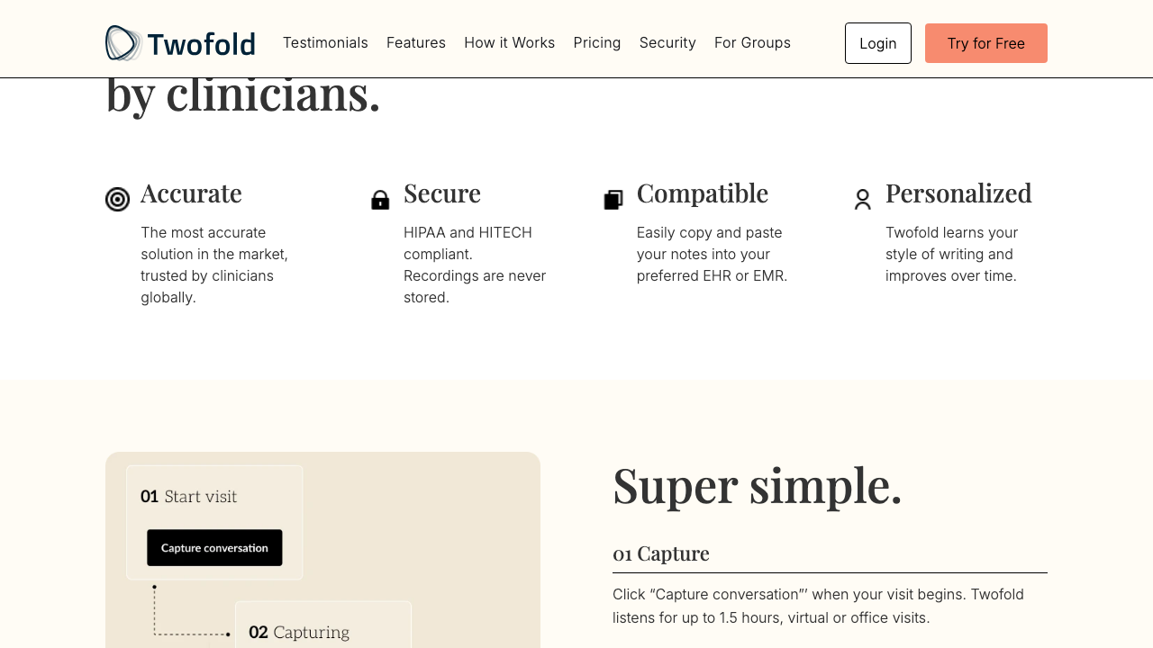
Grade: B+
| Dimension | Assessment | Grade |
|---|---|---|
| Visual Design | "Built for clinicians, by clinicians" heading with 4 icon-led value props. Clean grid layout. Good transition into How It Works. | B+ |
| Copy Effectiveness | Four props (Accurate, Secure, Compatible, Personalized) are concise and address key concerns. "Recordings are never stored" is a strong statement. | A- |
| Psychological Triggers | Authority via "built by clinicians." Addresses fear (security) and desire (personalization). | B+ |
| Interaction Design | Static content, no interaction needed. Scannable layout. | B+ |
| Trust & Friction | "HIPAA and HITECH compliant" + "Recordings are never stored" directly address the #1 clinician concern. | A |
| Conversion Mechanics | "Super simple" heading bridges well into how-it-works. The 3-step visual (Start → Capture → Note) is clear. | B+ |
| Technical UX | Clean rendering. Icons are clear. | B+ |
| Source Code Insights | Feature props are static Astro components. No dynamic content or personalization here. | B |
Top Recommendation: Make "Compatible" more specific — name top EHR systems (Epic, Cerner, etc.) to increase concreteness.
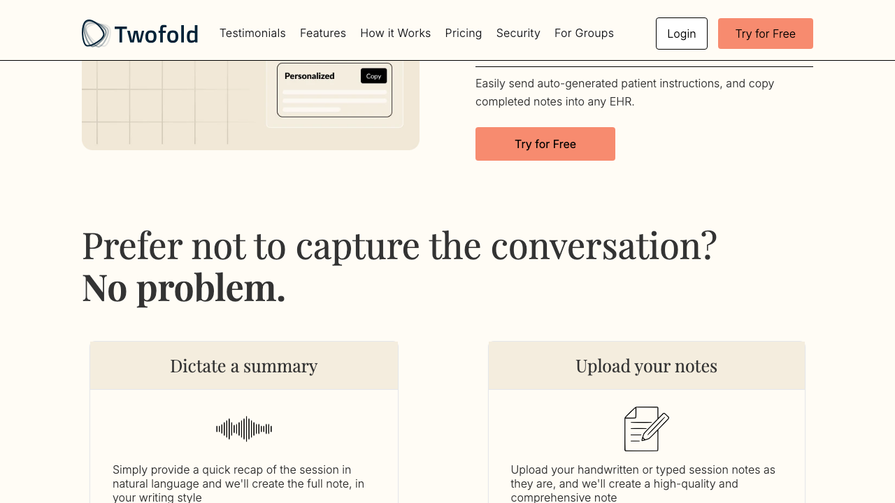
Step 4: Landing Page — How It Works + Alternative Inputs (Desktop)
Grade: B+
| Dimension | Assessment | Grade |
|---|---|---|
| Visual Design | CTA button after the 3-step flow is well-placed. "Prefer not to capture?" section is welcoming and non-judgmental. | B+ |
| Copy Effectiveness | "Prefer not to capture the conversation? No problem." — Excellent objection handling. Dictate and Upload options shown clearly. | A |
| Psychological Triggers | Addresses the primary objection (recording patients) before the user even signs up. Removes a major barrier. | A |
| Interaction Design | Two-column layout for alternatives is clear. Each has icon, heading, and description. | B+ |
| Trust & Friction | Acknowledging recording anxiety and offering alternatives is a trust-builder. | A |
| Conversion Mechanics | Second CTA ("Try for Free") captures users convinced by the process explanation. | A- |
| Technical UX | Good spacing. Visual hierarchy is clear. | B+ |
| Source Code Insights | How-it-works steps use a visual flow diagram component. CTA is tracked with try_free_howitworks ID. | B+ |
Top Recommendation: Add a brief video or GIF showing the actual recording → note generation flow. Seeing it is believing.
Step 5: Landing Page — Value Prop + Pricing (Desktop)
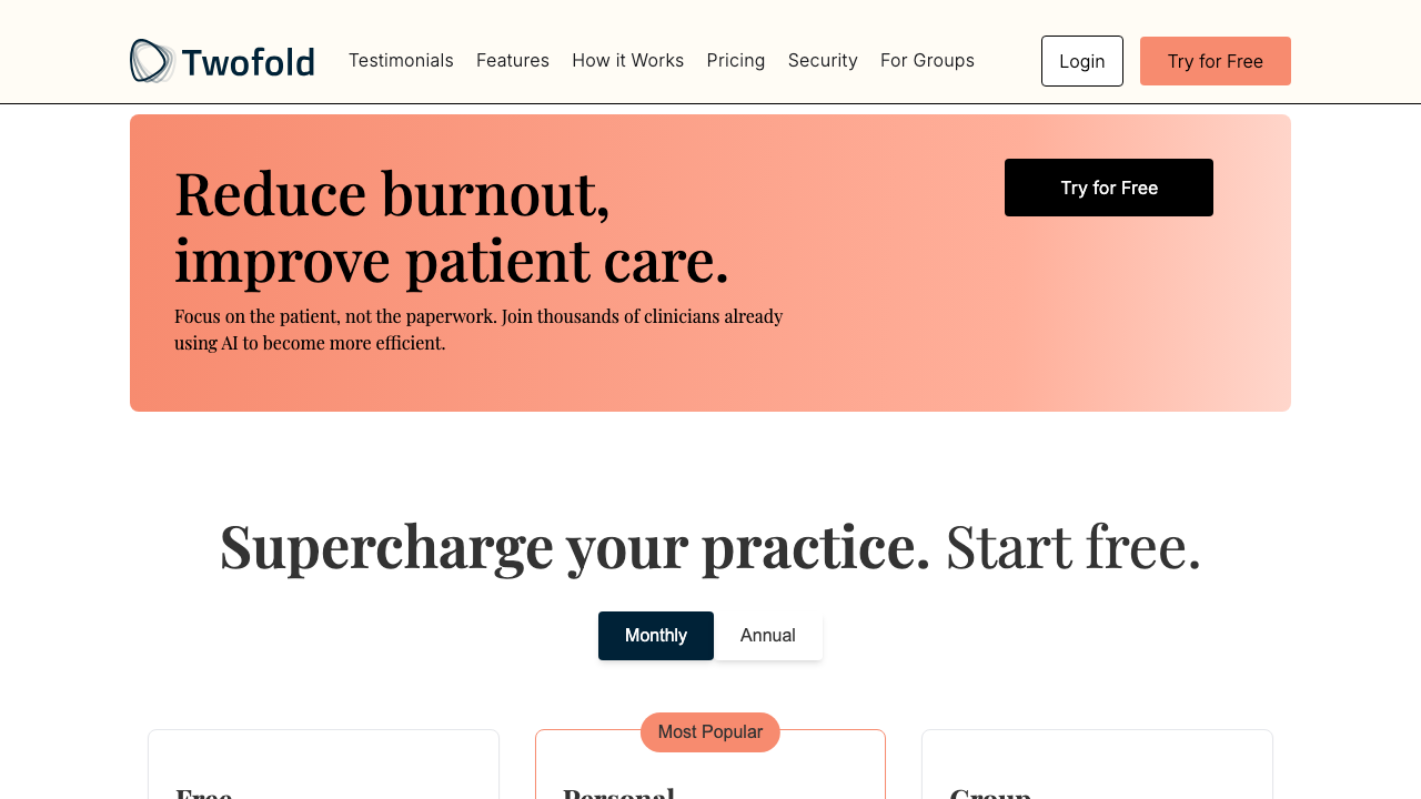
Grade: B+
| Dimension | Assessment | Grade |
|---|---|---|
| Visual Design | Gradient peach banner for "Reduce burnout" is visually distinct. Pricing section headline is clean. Monthly/Annual toggle is standard. | B+ |
| Copy Effectiveness | "Reduce burnout, improve patient care" — hits the emotional core. "Focus on the patient, not the paperwork" is the perfect one-liner. | A |
| Psychological Triggers | Loss aversion ("reduce burnout"), social proof ("thousands of clinicians"), and aspiration ("improve patient care"). | A |
| Interaction Design | Monthly/Annual pricing toggle is standard and expected. | B+ |
| Trust & Friction | "Start free" in headline + "No credit card needed" under CTA. Free tier visible. | A- |
| Conversion Mechanics | Third CTA within the value prop section. Pricing immediately follows — good sequencing. | A- |
| Technical UX | Pricing toggle works smoothly. Card layout is clean. | B+ |
| Source Code Insights | Pricing is SSR-rendered (PricingSectionSSR.astro) for dynamic content. Annual toggle fetches different prices. Referral program ("Refer 2 friends, get 1 year free") is below pricing. | B+ |
Top Recommendation: Show actual price savings for Annual vs Monthly more prominently — the toggle exists but the savings aren't highlighted.
Step 6: Landing Page — Pricing Details (Desktop)
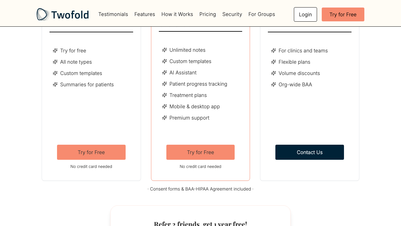
Grade: B
| Dimension | Assessment | Grade |
|---|---|---|
| Visual Design | Three-tier layout (Free, Personal, Group). "Most Popular" badge on Personal. Clean feature lists. | B+ |
| Copy Effectiveness | Feature lists are clear but clinical ("AI Assistant", "Treatment plans"). Could be more benefit-oriented. | B |
| Psychological Triggers | "Most Popular" badge uses bandwagon effect. Free tier anchors the paid tiers. | B+ |
| Interaction Design | Consistent CTA buttons per tier. "Contact Us" for Group. "No credit card needed" text. | B |
| Trust & Friction | "Consent forms & BAA-HIPAA Agreement included" at bottom is a strong trust signal for medical practices. | A- |
| Conversion Mechanics | Two "Try for Free" buttons for Free and Personal tiers. Group tier funnels to contact. | B |
| Technical UX | Three-column responsive grid. Feature lists are vertically unbalanced. | B |
| Source Code Insights | Pricing is dynamic (SSR). Group tier links to /for-groups/schedule. Free tier exists as anchor. | B |
Top Recommendation: Rewrite feature lists as benefit statements ("Save 2+ hours daily" instead of "Unlimited notes") to increase conversion appeal.
Step 7: Landing Page — Security Section (Desktop)
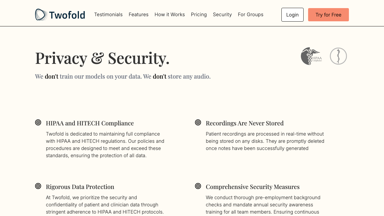
Grade: A-
| Dimension | Assessment | Grade |
|---|---|---|
| Visual Design | "Privacy & Security" heading with HIPAA logo and medical caduceus. Six security commitment cards with consistent styling. | A- |
| Copy Effectiveness | "We don't train models on your data. We don't store any audio." — Bold emphasis on negatives is highly effective for anxious clinicians. | A |
| Psychological Triggers | Addresses the biggest AI fear (data training) head-on. Repeated emphasis on what they DON'T do builds trust. | A |
| Interaction Design | Static content. Scannable card layout. | B+ |
| Trust & Friction | This is the trust section — HIPAA/HITECH compliance, data protection, Microsoft Azure BAA. Comprehensive. | A |
| Conversion Mechanics | Fifth CTA "Try for Free" captures security-conscious users. Well-placed after all trust signals. | A- |
| Technical UX | Clean layout. Good use of icons. | B+ |
| Source Code Insights | Security section has its own ID (#security) for deep linking from nav. CTA tracked as start_free_security. | B+ |
Top Recommendation: Add a downloadable BAA/security whitepaper link for compliance-minded clinic administrators.
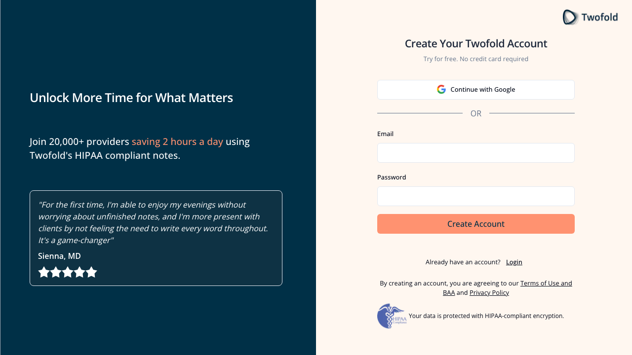
Step 9: Signup Page (Desktop)
Grade: B+
| Dimension | Assessment | Grade |
|---|---|---|
| Visual Design | Split layout: dark navy left panel with social proof, light right panel with form. Professional and clean. | A- |
| Copy Effectiveness | "Unlock More Time for What Matters" — strong emotional headline. "Join 20,000+ providers saving 2 hours a day" — specific numbers build credibility. Rotating testimonial adds social proof. | A |
| Psychological Triggers | Social proof (20,000+ providers, 2 hours/day). Authority (MD testimonial). Loss aversion ("Unlock More Time"). | A |
| Interaction Design | Google OAuth + email/password. Only 2 fields. "Create Account" CTA is large and coral-colored. | B+ |
| Trust & Friction | HIPAA badge + encryption message at bottom. Terms of Use and Privacy Policy linked. "No credit card required" subhead. | A- |
| Conversion Mechanics | Google OAuth as primary option reduces friction. Email fallback available. Minimal form fields. | B+ |
| Technical UX | Page loads fast. Form validation with Clerk. No CAPTCHA visible. | A- |
| Source Code Insights | Uses Clerk for authentication. Rotating testimonial uses radio buttons as indicators (5 testimonials). Redirect to /sign-up from /get-started. | B+ |
Top Recommendation: Add password strength indicator and show/hide password toggle to reduce form anxiety.
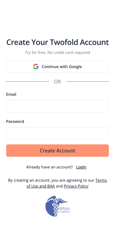
Step 9M: Signup Page (Mobile)
Grade: B-
| Dimension | Assessment | Grade |
|---|---|---|
| Visual Design | The entire left panel (value prop, testimonial, headline) is hidden on mobile. User only sees the form. | C+ |
| Copy Effectiveness | "Create Your Twofold Account" is generic without the "Unlock More Time" framing from the left panel. "Try for free. No credit card required" is still present. | B- |
| Psychological Triggers | Social proof and emotional messaging are completely absent on mobile signup. Major gap. | C |
| Interaction Design | Clean form layout. Fields are appropriately sized for touch. Google OAuth button is prominent. | B+ |
| Trust & Friction | HIPAA badge still at bottom. But missing the testimonial and "20,000+ providers" stat. | B- |
| Conversion Mechanics | Form works but lacks the persuasion elements that drive desktop signups. | C+ |
| Technical UX | Responsive but sacrifices too much context. Form is functional. | B |
| Source Code Insights | Split layout uses CSS hidden class on mobile. The left panel content is rendered but display:none'd. | C+ |
Top Recommendation: Add at least one testimonial quote and the "20,000+ providers" social proof stat above the form on mobile. The mobile signup page is stripping away all the persuasion that drives conversion.
Step 11: Onboarding — Welcome Step (Desktop)
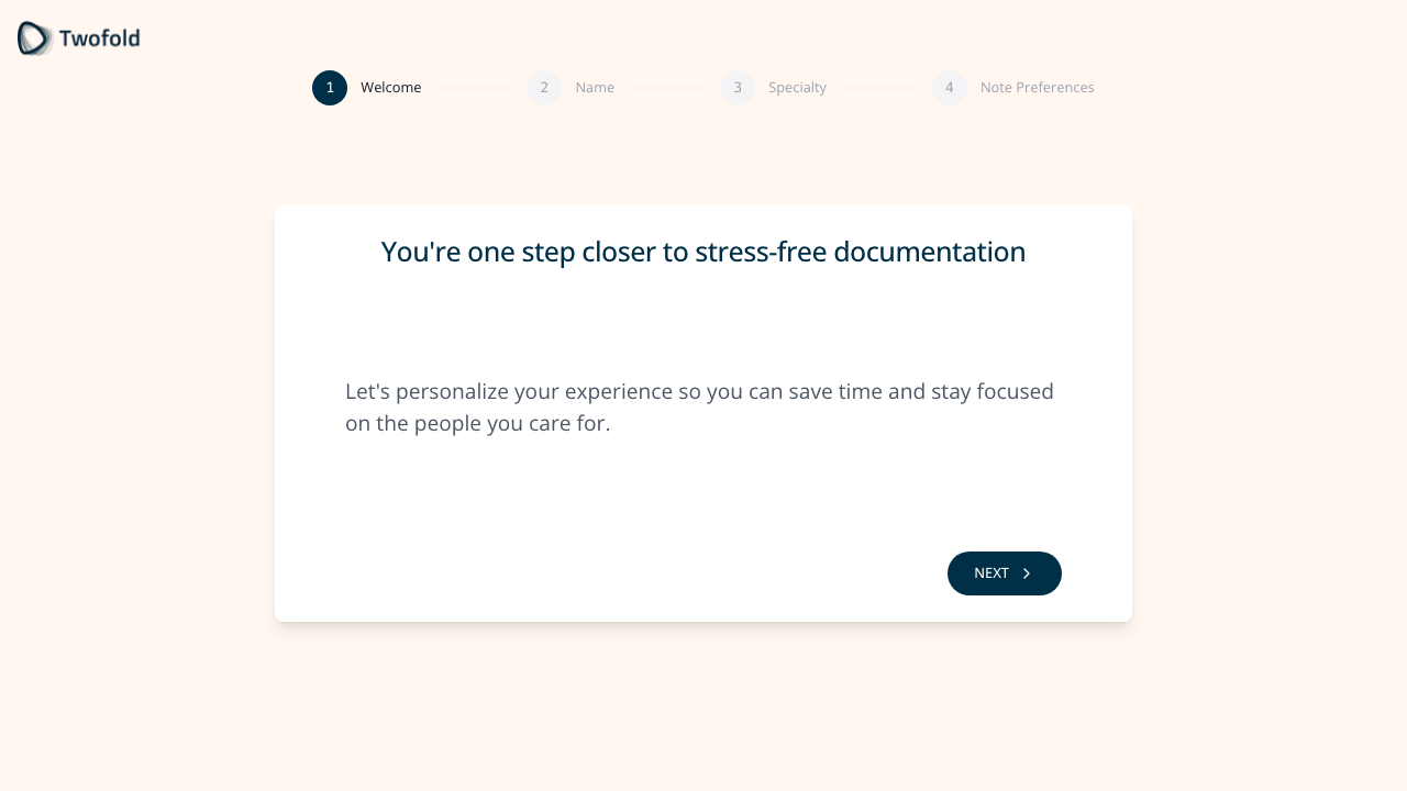
Grade: C+
| Dimension | Assessment | Grade |
|---|---|---|
| Visual Design | Centered card with step progress indicator (1-4). Clean but feels empty — large whitespace without purpose. | C+ |
| Copy Effectiveness | "You're one step closer to stress-free documentation" — positive framing. But "Let's personalize your experience" is generic. | B- |
| Psychological Triggers | Commitment/consistency (they've signed up, now personalizing). But no urgency or excitement. | C |
| Interaction Design | Single "NEXT" button. Back button disabled (correct for first step). Step progress shows 4 steps ahead. | B |
| Trust & Friction | This step collects no data — it's pure friction. User must click through an informational screen. | D |
| Conversion Mechanics | This is a speed bump. Every unnecessary click is a potential drop-off. | D |
| Technical UX | Auto-animated step transitions. Clean rendering. | B+ |
| Source Code Insights | Fires onboarding_wizard_welcome_step_viewed event. No data mutation. No conditional logic. Pure informational step. | D |
Top Recommendation: Remove this step entirely. It collects no data, delivers no value, and adds friction. Merge the welcome message into the name step as a header.
Step 11M: Onboarding — Welcome Step (Mobile)
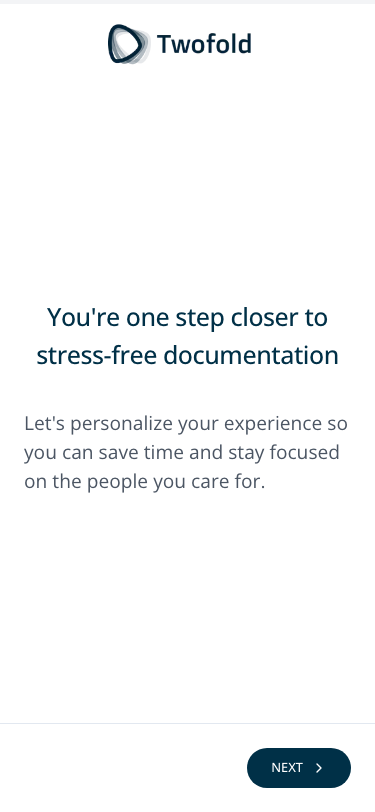
Grade: C
| Dimension | Assessment | Grade |
|---|---|---|
| Visual Design | Enormous amount of wasted whitespace. Logo at top, content centered in lower third. NEXT button barely visible at bottom edge. | C- |
| Copy Effectiveness | Same copy as desktop. Feels even more sparse on a small screen. | C+ |
| Psychological Triggers | No progress indicator visible on mobile (replaced by a thin progress bar at the very top). User has no sense of how many steps remain. | C- |
| Interaction Design | NEXT button is small and pinned to bottom-right. Could easily be missed. | C |
| Trust & Friction | Same issue as desktop — no data collected, pure friction. Worse on mobile where every screen change feels heavier. | D |
| Conversion Mechanics | On mobile, each additional screen is more costly. This step is especially problematic on phone. | D |
| Technical UX | Progress bar is a thin line at top — almost invisible. Layout is too sparse. | C- |
| Source Code Insights | Mobile uses progressbar element instead of step progress circles. Different layout component for mobile. | C |
Top Recommendation: Same as desktop — eliminate this step. On mobile it's even more damaging to completion rates.
Step 12: Onboarding — Name Step (Desktop)
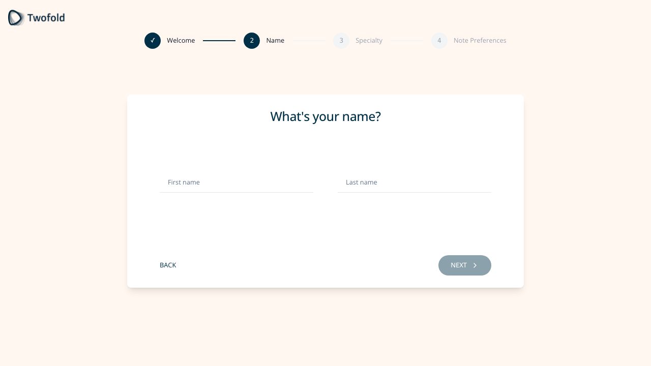
Grade: B
| Dimension | Assessment | Grade |
|---|---|---|
| Visual Design | Clean card with "What's your name?" heading. Two inline fields. Step 2 highlighted in progress. | B+ |
| Copy Effectiveness | "What's your name?" is direct and friendly. Placeholder text "First name" / "Last name" is clear. | B |
| Psychological Triggers | Personalization promise from welcome step pays off here — asking for name makes the experience feel tailored. | B |
| Interaction Design | Two fields side-by-side on desktop. NEXT disabled until both filled. BACK button available. | B+ |
| Trust & Friction | Minimal friction — only 2 fields. Pre-fills from Clerk if available (reducing effort). | B+ |
| Conversion Mechanics | Low-effort step. Good that it's quick. | B+ |
| Technical UX | Form validation with zod. Tracks first edits for analytics. | B+ |
| Source Code Insights | Pre-fills from both Clerk auth and getUserPersonalInformation API. Tracks edit events separately per field. | B+ |
Top Recommendation: Consider auto-filling from Google OAuth data more aggressively — if the user signed in with Google, pre-fill and auto-advance.
Step 14: Onboarding — Specialty Step (Desktop)
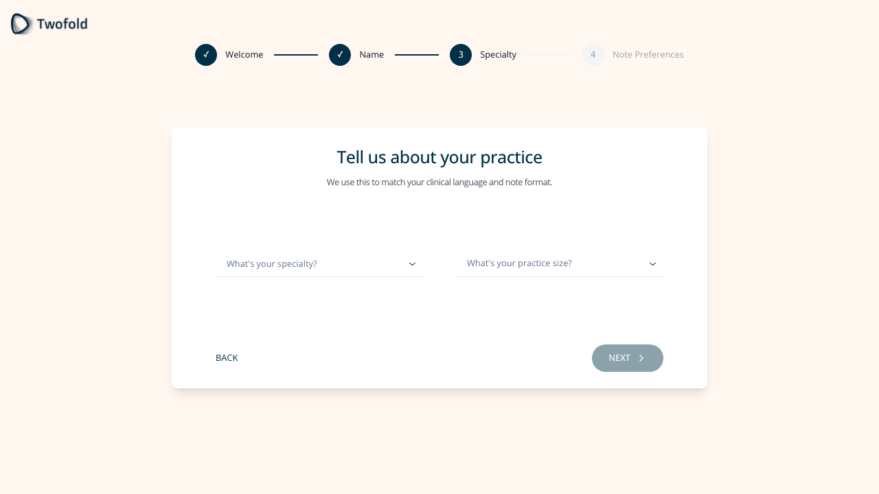
Grade: B+
| Dimension | Assessment | Grade |
|---|---|---|
| Visual Design | Same card layout. Subtitle "We use this to match your clinical language and note format" explains the why. | B+ |
| Copy Effectiveness | "Tell us about your practice" is clear. The subtitle gives purpose to the data collection. | A- |
| Psychological Triggers | Explaining why data is collected ("match your clinical language") increases willingness to provide it. Reciprocity — they're giving value for your data. | A- |
| Interaction Design | Searchable dropdown for specialty. Second dropdown for practice size. Both with clear placeholders. Specialty search filters dynamically. | A- |
| Trust & Friction | Explaining the "why" reduces perceived friction. Practice size is 4 simple options. | B+ |
| Conversion Mechanics | This data is genuinely valuable — it auto-configures templates. Good value exchange. | A- |
| Technical UX | Search-as-you-type for specialty works well. 13+ specialties matched for "Psych" alone. | A- |
| Source Code Insights | Specialty selection triggers setEnabledCustomTemplatesByMedicalSpecialty — directly personalizes the product. Practice size options are hardcoded. | A |
Top Recommendation: Show a preview of what templates will be enabled based on specialty selection to make the value exchange more tangible.
Step 17: Onboarding — Note Preferences (Desktop)
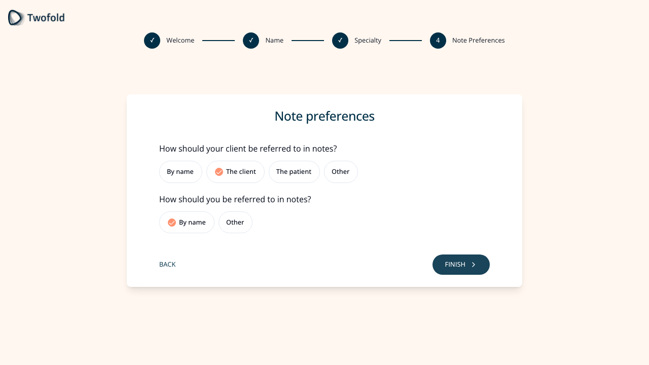
Grade: B
| Dimension | Assessment | Grade |
|---|---|---|
| Visual Design | Chip/pill selection pattern for options. Clear grouping of two questions. "FINISH" button signals completion. | B+ |
| Copy Effectiveness | Questions are clear: "How should your client be referred to in notes?" Uses "client" language for psychotherapy context. | B+ |
| Psychological Triggers | Smart defaults (psychotherapy → "The client") show the product already understands the user's domain. | A- |
| Interaction Design | Pill selection is intuitive. Pre-selected defaults reduce decision fatigue. "Other" with custom input available. | B+ |
| Trust & Friction | Quick step with sensible defaults. User can accept and move on. | B |
| Conversion Mechanics | "FINISH" button text builds anticipation — we're almost done. | B+ |
| Technical UX | Checkboxes with pill styling. Zod validation for custom inputs. | B |
| Source Code Insights | Feature-flagged step. When off, shows "You're all set!" completion step instead. Default logic reads specialty to set patient referral term. | B+ |
Top Recommendation: Add a live preview showing how a sample note would look with the selected preferences to make this feel immediately valuable.
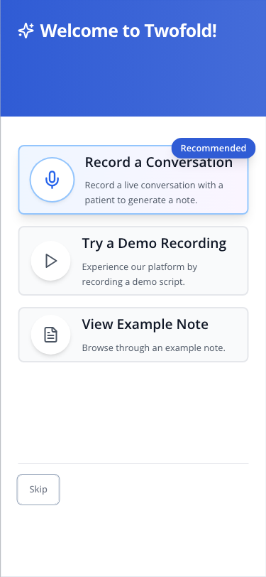
Step 18: NUX Dialog (Desktop)
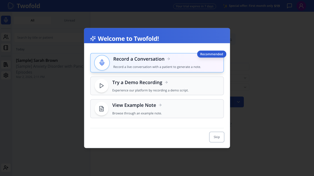
Grade: B+
| Dimension | Assessment | Grade |
|---|---|---|
| Visual Design | Modal overlay with purple gradient header. Three clear option cards with icons. "Recommended" badge on Record option. | A- |
| Copy Effectiveness | "Welcome to Twofold!" is friendly. Each option has clear title + one-line description. | B+ |
| Psychological Triggers | "Recommended" badge uses authority/default bias to guide toward recording. Progressive disclosure — three comfort levels. | A- |
| Interaction Design | Three clickable cards. Skip button at bottom (small, secondary). Clear visual hierarchy. | B+ |
| Trust & Friction | Skip option reduces pressure. Demo and Sample options provide low-risk alternatives. | A- |
| Conversion Mechanics | Good progressive disclosure — record (high commitment), demo (medium), sample (low), skip (zero). | A- |
| Technical UX | Dialog appears after 2s delay. Prefetches demo and sample routes. Overlay prevents interaction with background. | B+ |
| Source Code Insights | Skip tracked as "skip_button" vs "outside_dialog". All three options + skip permanently set didFinishNuxDialog: true. Record stays on page, Demo → /demo, Sample → /notes/{id}. | A- |
Top Recommendation: Make "Try a Demo Recording" more prominent — it's the safest path for uncertain users and likely has the best activation rate.
Step 18M: NUX Dialog (Mobile)
Grade: B
| Dimension | Assessment | Grade |
|---|---|---|
| Visual Design | Takes full screen on mobile (good — no awkward modal sizing). Cards are stacked vertically. Skip at bottom-left. | B+ |
| Copy Effectiveness | Same copy. Cards are slightly truncated but readable. | B |
| Psychological Triggers | "Recommended" badge visible. Same three-tier progressive disclosure. | B+ |
| Interaction Design | Full-width cards are easy tap targets. Good for mobile. Skip button is small but accessible. | B |
| Trust & Friction | Full-screen presentation eliminates the confusing "what's behind the dialog" problem. | B+ |
| Conversion Mechanics | Clear option hierarchy works on mobile. Less likely to accidentally dismiss (no outside-click on full-screen). | B+ |
| Technical UX | Full-screen mode is better for mobile than the desktop overlay pattern. | B+ |
| Source Code Insights | Same component, responsive rendering. Full-screen dialog prevents the outside-click skip pattern. | B |
Top Recommendation: Consider making the Demo option the recommended one on mobile — users coming from Facebook ads on their phone are less likely to be in a live patient session.
Step 19: /new Page — Initial State (Desktop)
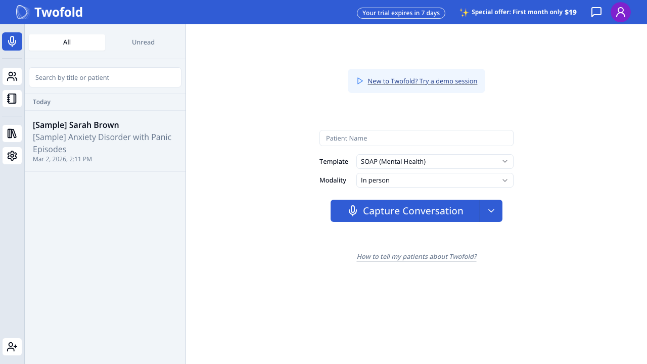
Grade: C+
| Dimension | Assessment | Grade |
|---|---|---|
| Visual Design | Sparse center-aligned form. Left sidebar with sample note. Large empty space below the capture button. Feels incomplete. | C |
| Copy Effectiveness | "New to Twofold? Try a demo session" link at top is small and easy to miss. "Patient Name" placeholder is functional but cold. | C |
| Psychological Triggers | Almost none. No guidance, no encouragement, no reinforcement of the value they signed up for. Momentum from onboarding is completely lost. | D |
| Interaction Design | Template auto-selected (SOAP Mental Health for psychotherapy). Modality defaults to "In person". Split button with dropdown chevron for alternatives. | B |
| Trust & Friction | "Your trial expires in 7 days" creates urgency but also anxiety. "Special offer: First month only $19" is premature — user hasn't experienced value yet. | C- |
| Conversion Mechanics | The "Capture Conversation" button is the only clear CTA, but there's no guidance on what to do first. Should they enter a patient name? Select a template? Just press the button? | C |
| Technical UX | Sidebar loads sample note. Top bar has trial countdown and special offer. | B |
| Source Code Insights | numberOfSuccessfulVisits === 0 shows demo script card. Patient context pane hidden when demo card showing. Template pre-selected by specialty. | C+ |
Top Recommendation: Add a guided first-action experience — a tooltip, coach mark, or short instruction text that says "Ready for your first note? Press Capture Conversation during your next session, or try a demo first." The page assumes users know what to do, but after 7 screens of setup, they need a nudge.
Step 19M: /new Page — Initial State (Mobile)
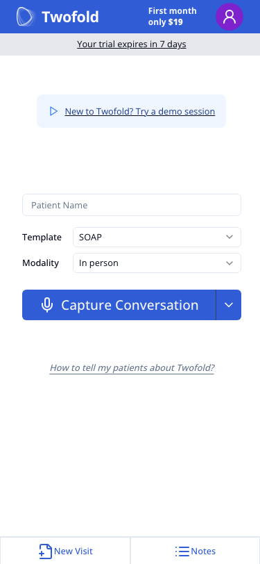
Grade: C-
| Dimension | Assessment | Grade |
|---|---|---|
| Visual Design | Top bar is crowded: logo, promo, profile icon, trial badge all competing. Below is the sparse form. Very little visual guidance. | C- |
| Copy Effectiveness | "New to Twofold? Try a demo session" is present but small. No sidebar or context. Template shows "SOAP" (truncated from "SOAP (Mental Health)"). | C |
| Psychological Triggers | Zero emotional momentum. Coming from the NUX dialog's "Welcome to Twofold!" to this sparse form is jarring. | D |
| Interaction Design | Full-width Capture Conversation button is thumb-friendly. Dropdown chevron is small but accessible. Patient Name field is clear. | B- |
| Trust & Friction | "Your trial expires in 7 days" is the first thing visible below the header. Combined with "First month only $19" — feels like a sales push, not a welcome. | D+ |
| Conversion Mechanics | On mobile, there's nothing below the capture button except "How to tell my patients" link and empty space. No sample note sidebar, no context pane. The user is alone on this page. | D |
| Technical UX | Bottom tab nav shows "New Visit" and "Notes" tabs. Layout is clean but bare. Template label truncated. | C |
| Source Code Insights | Mobile uses new-visit-mobile-web-component.tsx with larger buttons (h-14). Patient context pane is disabled on mobile. No sample note visible in sidebar. | C- |
Top Recommendation: The mobile /new page is the #1 activation killer. Add an inline guided experience: a "Here's how it works" card with 3 simple steps, a prominent demo button, and hide the trial/pricing urgency messages for first-time users. The 65% mobile drop-off is directly explained by this empty, guidance-free, anxiety-inducing page.
Step 20: /new Page — Capture Alternatives (Desktop)
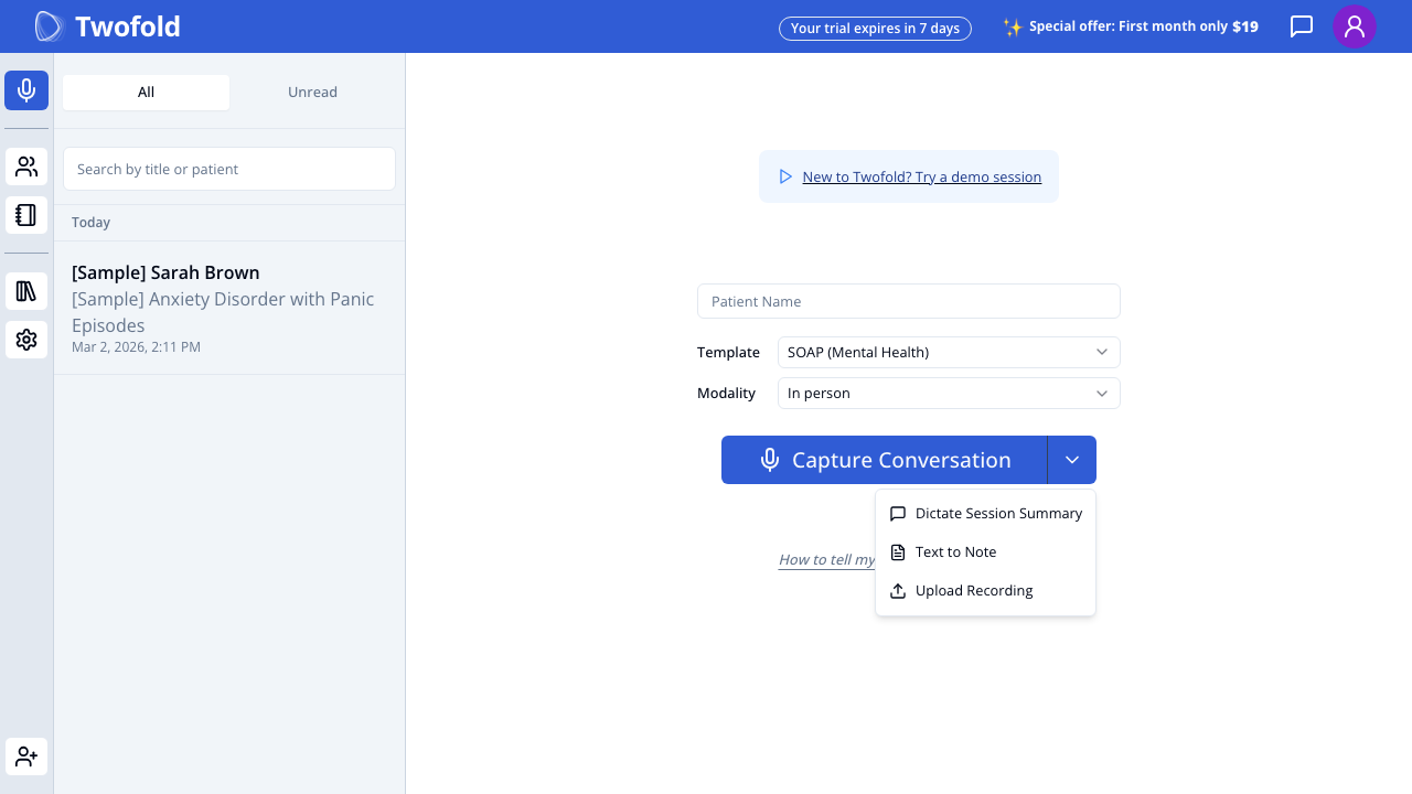
Grade: B-
| Dimension | Assessment | Grade |
|---|---|---|
| Visual Design | Dropdown shows 3 alternatives below the button: Dictate Session Summary, Text to Note, Upload Recording. Clean menu with icons. | B |
| Copy Effectiveness | Option names are clear. But they're hidden in a dropdown — many users will never discover them. | C+ |
| Psychological Triggers | Alternatives reduce the pressure to record a live conversation. But they're too hidden. | C |
| Interaction Design | Split button pattern is standard but not intuitive for non-technical users. Many clinicians won't know to click the small chevron. | C |
| Trust & Friction | Alternatives are the key to reducing activation friction, but their discoverability is poor. | C+ |
| Conversion Mechanics | These alternatives could be the answer to the activation bottleneck, but they're buried in a dropdown. | C |
| Technical UX | Dropdown renders cleanly. Persists selection to localStorage. | B |
| Source Code Insights | 4 capture types: CAPTURE_CONVERSATION, DICTATE_SESSION_SUMMARY, TEXT_TO_NOTE (→ /text-to-note), UPLOAD_RECORDING (→ /upload-recording). Selected type persisted in localStorage via Zustand. | B |
Top Recommendation: Surface the alternatives as visible options on the page, not hidden in a dropdown. Show them as cards or secondary buttons: "Don't have a patient right now? Dictate a summary, type your notes, or upload a recording." This alone could significantly improve activation rates.
Step 21: /new Page — Template Selector (Desktop)
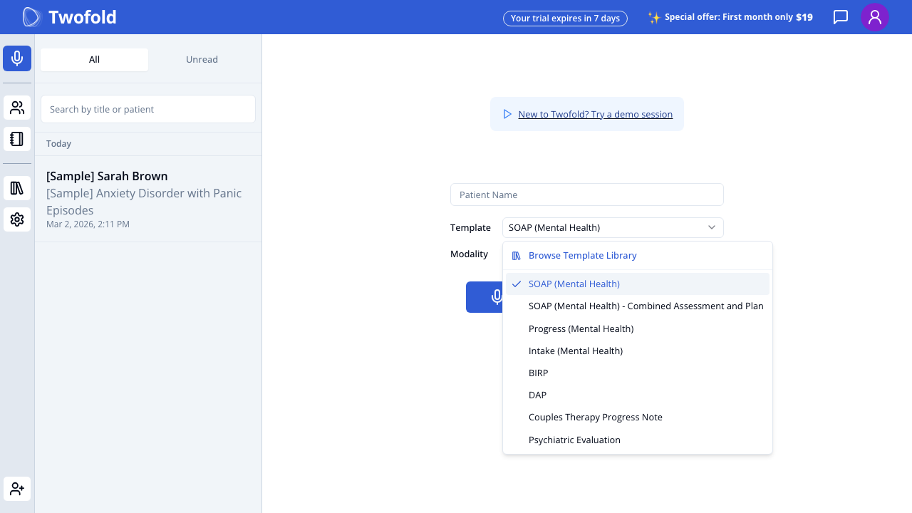
Grade: B+
| Dimension | Assessment | Grade |
|---|---|---|
| Visual Design | Dropdown with "Browse Template Library" at top, followed by specialty-matched templates. Checkmark on selected template. | B+ |
| Copy Effectiveness | Template names are professional and clinical. "Browse Template Library" encourages exploration. | B+ |
| Psychological Triggers | Specialty-matched templates show the onboarding data was used — feels personalized. | A- |
| Interaction Design | Dropdown with clear selection state. "Browse Template Library" links to full template management. | B+ |
| Trust & Friction | Template auto-selection from specialty reduces friction. Multiple options available without leaving page. | B+ |
| Conversion Mechanics | Good that the default template is pre-selected — user doesn't need to choose to start. | A- |
| Technical UX | Templates loaded from server. Specialty-based filtering worked correctly. | B+ |
| Source Code Insights | NoteTypeSelection component shows custom templates first, then system custom, then static. setEnabledCustomTemplatesByMedicalSpecialty auto-enables matching templates during onboarding. | A- |
Top Recommendation: Show a brief preview of what each template generates (section structure) on hover/tap to help users choose confidently.
Step 22: Sample Note (Desktop)
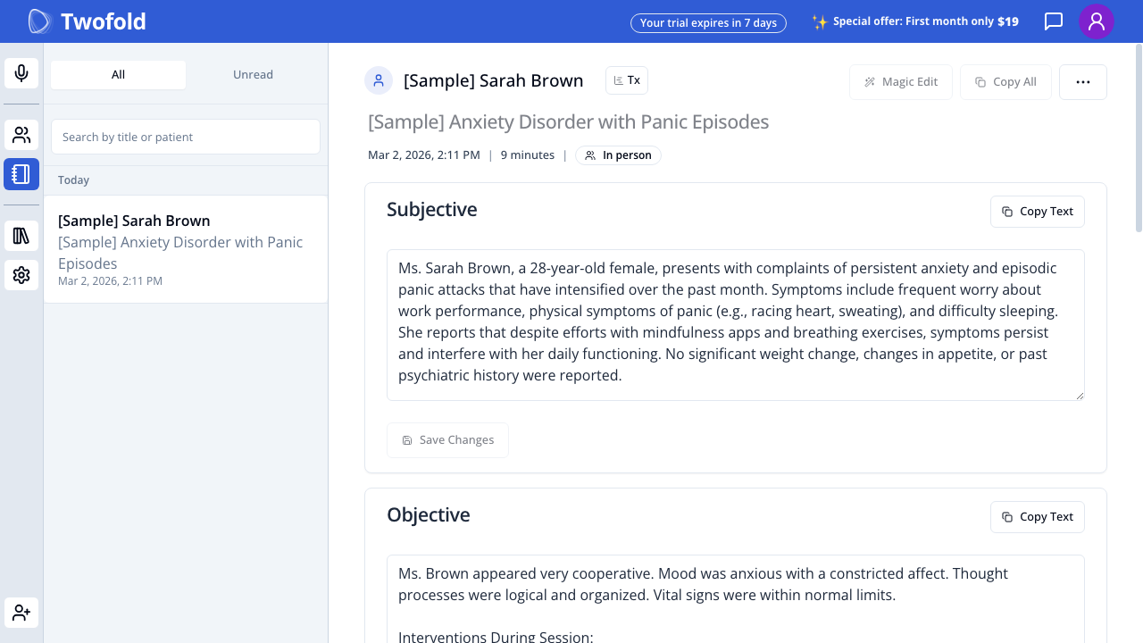
Grade: B+
| Dimension | Assessment | Grade |
|---|---|---|
| Visual Design | Clean note layout with clear section headers (Subjective, Objective). "Copy Text" and "Save Changes" buttons per section. "Magic Edit" and "Copy All" in header. | B+ |
| Copy Effectiveness | Sample note content is realistic and clinically accurate (anxiety disorder with panic episodes). Professional language. | A |
| Psychological Triggers | Seeing a completed note is the "aha moment" — this is what the product does. Highly effective for activation. | A |
| Interaction Design | Editable text areas. Per-section copy buttons. Magic Edit feature visible. Patient name and metadata in header. | B+ |
| Trust & Friction | Clinical quality of the sample note builds trust in the AI's capability. | A |
| Conversion Mechanics | This is the best activation tool — but it's only accessible through the sidebar or NUX dialog "View Example Note" option. | B- |
| Technical UX | Full note rendering with all sections. Sidebar shows the note in the list. | B+ |
| Source Code Insights | Sample note ID is hardcoded (sampleVisitId). Note has full SOAP structure, visit metadata (9 minutes, In person), and Tx icon for treatment plan. | B+ |
Top Recommendation: Make the sample note more prominent in the /new page experience — show it inline or as a prominent card rather than hidden in the sidebar.
Cross-Step Analysis
Friction Map
Ranked by severity (highest drop-off risk first):
-
🔴 /new page → First recording (Step 19/19M) — The activation cliff. 50% desktop / 65% mobile drop-off. Sparse page, no guidance, no emotional momentum, hidden alternatives.
-
🟠 NUX dialog → Skip (Step 18/18M) — Users who skip bypass the guided paths (demo, sample). They land on /new with zero context. Skip rate should be tracked and minimized.
-
🟡 Welcome step (Step 11/11M) — Pure friction. No data collected. Every unnecessary screen reduces completion rate by ~5-10%.
-
🟡 Landing page CTA → Signup page (mobile) (Step 1M → 9M) — Mobile signup loses all the left-panel persuasion content. Users go from rich messaging to a bare form.
-
🟢 Specialty step → Note preferences (Step 14 → 17) — Minor friction but justified by personalization value.
Value Delivery Timeline
SIGNUP                                            FIRST VALUE
  │                                                    │
  ├── Welcome (no value) ──────────────────────────────┤
  ├── Name (no value) ─────────────────────────────────┤
  ├── Specialty (personalization promise) ──────────────┤
  ├── Note Preferences (personalization promise) ──────┤
  ├── NUX Dialog (value preview if Demo/Sample) ───────┤
  ├── /new Page (WAITING for user action) ─────────────┤
  │                                                    │
  └── User creates first note ─────────────────────────┘
                                                    ↑
                                        THIS IS TOO LATE
The first real value experience requires the user to complete 7-8 screens AND then take a high-commitment action (recording a conversation). The NUX dialog's "View Example Note" option is the closest thing to early value delivery, but it requires the user to actively choose it.
Recommendation: Show a sample note output during onboarding (e.g., after specialty selection) to deliver value before asking for the final commitment on /new.
Drop-Off Risk Assessment
| Transition | Risk Level | Estimated Drop-Off | Why |
|---|---|---|---|
| Landing → Signup | Low | 5-15% | Strong CTA, clear value prop |
| Signup → Onboarding | Very Low | 2-5% | No email verification, seamless redirect |
| Welcome → Name | Medium | 5-10% | Unnecessary screen, adds friction |
| Name → Specialty | Low | 3-5% | Quick step, low effort |
| Specialty → Note Prefs | Low | 3-5% | Smart defaults reduce friction |
| Note Prefs → NUX | Very Low | 1-2% | "FINISH" creates completion motivation |
| NUX → /new | Low | 5-10% | Dialog is clear, but skip = lost guidance |
| /new → First action | Very High | 50% desktop / 65% mobile | Sparse page, no guidance, high commitment |
Information Architecture
What's asked too early:
- Welcome step (no data needed — eliminate)
What's asked at the right time:
- Name, Specialty, Note Preferences — all collected before the product experience, used to personalize it
What's missing:
- Use case / intent ("Are you here to try it out, or ready to use it with patients?") — this would help route users to demo vs. live recording
- Primary workflow ("Do you mostly see patients in person or via telehealth?") — would improve modality default
/new Page Activation Analysis
The /new page is the critical activation bottleneck. Here is a dedicated analysis:
Is it immediately clear what the user should do first? No. The page shows Patient Name, Template, Modality, and Capture Conversation — four different elements with no indication of where to start. A clinician who just finished onboarding doesn't know if they need to fill in a patient name first, select a template, or just press the button.
Would a non-tech-savvy clinician from a Facebook ad know what to do? Unlikely. The page assumes familiarity with the product concept. A clinician coming from a Facebook ad that promised "AI-generated notes" sees a sparse form with a microphone button. The connection between pressing the button and getting notes is not obvious. The "New to Twofold? Try a demo session" link is too subtle.
Are alternatives to live recording visible and accessible? No — they're hidden in a small dropdown chevron next to the Capture Conversation button. The landing page prominently featured "Dictate a summary" and "Upload your notes" as alternatives, but on /new, they're buried. This is a major disconnect between the marketing promise and the product experience.
Does the page build confidence or create anxiety? Anxiety. Multiple factors:
- "Your trial expires in 7 days" countdown
- "Special offer: First month only $19" pricing pressure
- Empty patient name field (implies they need a patient ready)
- No explanation of what happens when they press the button
- No sample output showing what to expect
What's missing that could guide users toward their first action?
- Guided onboarding prompt ("Ready for your first note? Here's how:")
- Visible alternative actions (dictate, text, upload) as first-class options
- A sample note preview or "what you'll get" visualization
- Encouragement text ("It's okay to try with a demo first")
- Progress/checklist ("Complete your first note to unlock your trial")
How does the mobile experience differ — is the drop-off explainable by the mobile UI? Yes, the mobile drop-off (65% vs 50% desktop) is directly explainable:
- No sidebar — Mobile users don't see the sample note in the sidebar, losing the "this is what you'll get" anchor.
- No patient context pane — Desktop large screens show treatment plan and assistant tabs. Mobile has nothing.
- Crowded header — Trial countdown + pricing promo compete for attention.
- Truncated template name — "SOAP" instead of "SOAP (Mental Health)" reduces clarity.
- No emotional context — On mobile, the transition from NUX dialog to /new is especially jarring. The warm "Welcome to Twofold!" becomes a cold utility screen.
- Facebook ad users are often on mobile — These are the least committed users, seeing the most bare-bones experience.
Overall UX Scorecard
| Dimension | Score (1-10) | Key Finding |
|---|---|---|
| Visual Design | 7 | Landing page is polished; app pages are functional but sparse |
| Copy Effectiveness | 7.5 | Strong marketing copy; weak in-app guidance copy |
| Psychological Triggers | 6 | Great on landing page; almost zero on activation pages |
| Interaction Design | 7 | Smart defaults and personalization; split button is non-intuitive |
| Trust & Friction | 7 | HIPAA messaging is excellent; trial countdown creates anxiety |
| Conversion Mechanics | 5.5 | Good landing→signup; poor /new→first action conversion |
| Technical UX | 7.5 | Fast loads, good tracking, responsive; mobile misses features |
| Source Code Insights | 8 | Feature flags, smart defaults, comprehensive analytics. Well-engineered. |
| Overall | 6.9 | Strong top-of-funnel, weak bottom-of-funnel activation |
Top 10 Recommendations
-
Remove the Welcome Step — It collects no data and adds pure friction. Merge the heading into the name step.
- Impact: Medium
- Effort: Low
- Priority: P0
-
Redesign the /new Page with Guided Activation — Add a first-time user experience with step-by-step guidance, visible alternatives (not hidden in dropdown), and a sample note preview. Show "what you'll get" before asking users to act.
- Impact: High
- Effort: Medium
- Priority: P0
-
Surface Capture Alternatives as Visible Options — Show Dictate, Text to Note, and Upload Recording as first-class choices on /new, not hidden in a dropdown. Match the landing page's "Prefer not to capture?" messaging.
- Impact: High
- Effort: Low
- Priority: P0
-
Add Social Proof to Mobile Signup — Restore at least one testimonial and the "20,000+ providers" stat to the mobile signup page. Currently all persuasion is stripped away.
- Impact: Medium
- Effort: Low
- Priority: P1
-
Hide Trial Countdown for First Session — Don't show "Your trial expires in 7 days" and "$19 first month" on the user's first visit to /new. Replace with encouragement and guidance. Pricing pressure before value experience is counterproductive.
- Impact: Medium
- Effort: Low
- Priority: P1
-
Make Demo the Recommended Option on Mobile NUX — Mobile users coming from ads are unlikely to have a patient in front of them. Recommend the demo path on mobile to drive activation through the safest path.
- Impact: Medium
- Effort: Low
- Priority: P1
-
Show Sample Note During Onboarding — After specialty selection, show a preview of a generated note for their specialty. This delivers the "aha moment" before they even reach /new.
- Impact: High
- Effort: Medium
- Priority: P1
-
Add Inline Help to /new Page — A "How it works" expandable section or tooltip on the Capture Conversation button explaining: press to start, speak naturally, end when done, get your note.
- Impact: Medium
- Effort: Low
- Priority: P1
-
Improve Mobile Onboarding Progress Visibility — The thin progress bar at the top is nearly invisible. Add step count text ("Step 2 of 4") or a more visible progress indicator.
- Impact: Low
- Effort: Low
- Priority: P2
-
Add Intent-Based Routing — Ask during onboarding: "What brings you here today?" with options like "Try it out with a demo", "Use it in my next session", "Explore the product." Route each answer to the appropriate first action to match user readiness.
- Impact: High
- Effort: Medium
- Priority: P2